


In the month of May, we can't help but pay attention to letters and fonts. That's why we'll introduce you to four wonderful artists who work in the field of type. We started with Ani Petrova, Katerina Kiricheva and Milena Valnarova, and today it's the turn of...
Nikolay Petrusenko
Date and place of birth: November 1, 1990, Sofia
Education: Graphics at the Iliya Petrov National Institute of Art and Design – primary education; Book and print graphics at the National Academy of Arts – bachelor’s degree; Theory and practice of art education at the National Academy of Arts – bachelor’s degree; Font at the National Academy of Arts – master’s degree; Creative exchange at the Kunstuniversität, Linz, Austria.
Professional experience: Artist, illustrator, graphic and type designer in various media. After a long period of freelancing, he worked with Poststudio – a studio for visual communication and design, Sofia, Decotype, a studio for type design and typography in Arabic and other Middle Eastern scripts, Amsterdam. Currently, part of Fontfabrik – a leading type design studio, Sofia.
Exhibitions:
Solo exhibition at Alma Mater Gallery, Sofia University – 2010
33 group exhibitions in Bulgaria, Great Britain, Italy, Poland, Russia, Slovakia, France, Czech Republic. This month (May 2018 – ed.) the group exhibition of Plakat Kombinat Europe in Bulgarian is coming up at the Council of Europe to the EU, Strasbourg.
Awards:
The most important and recent awards:
Grand Prize at the Second International Student Biennial of Student Drawing, Sofia – 2014;
Special Jury Prize – 6th International Ex Libris Competition Bodio Lomnago Library Cinema, the Machine of Dreams – 2012
Second place at the National Drawing Competition, Sofia – 2009;
Grand Prize at the National Competition at the BOK for the Olympic Games in 2008
What does it actually mean to “deal with fonts”?
Creating a font is a long and complex process, the main stages of which are research, conceptual design, construction of a paper medium (writing or drawing) or direct drawing in font design software, determining the white spaces between letters and lines, programming and many, many tests.
Is there a difference between a letter and a font?
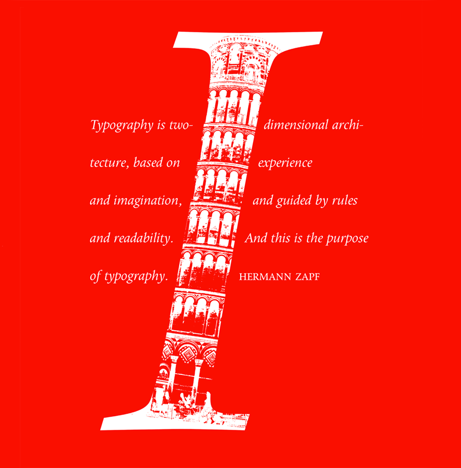
For a font to function well, each of its letters and characters must carry within itself a unified character and proportional dependence on each other. Yes, the letter is a separate part of the entire font system. The relationship between the concepts of "building" and "architectural complex" is analogous.
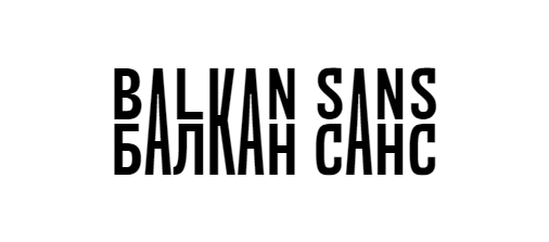
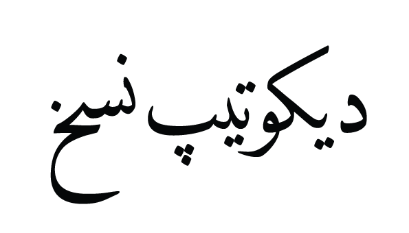
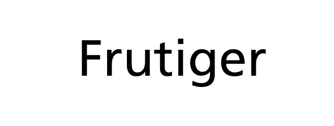
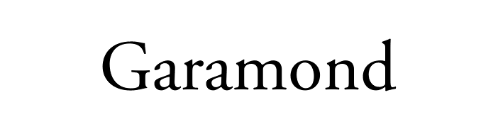
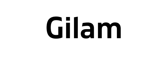
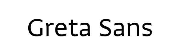
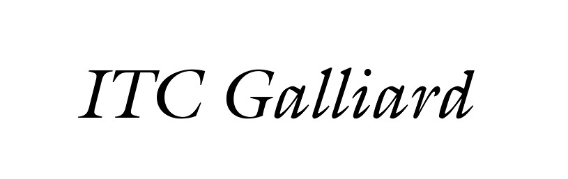
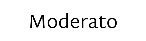
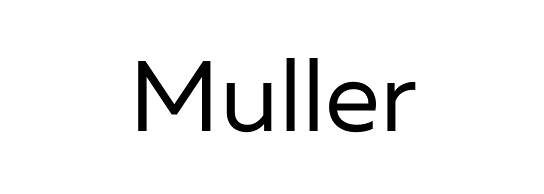
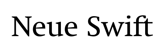
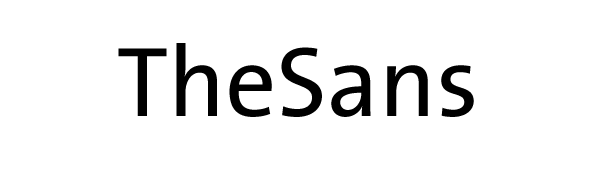
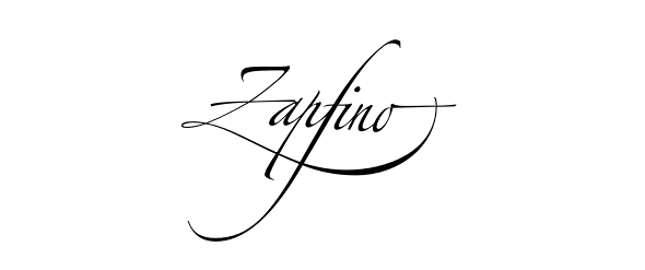
Favorite font: The list is long, but I can start with the following: Balkan Sans, DecoType Naskh, Frutiger, Garamond, Gilam, Greta Sans, ITC Galliard, Moderato, Muller, Neue Swift, TheSans, Zapfino, and many others...
Is a font an illustration?
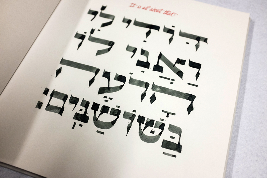
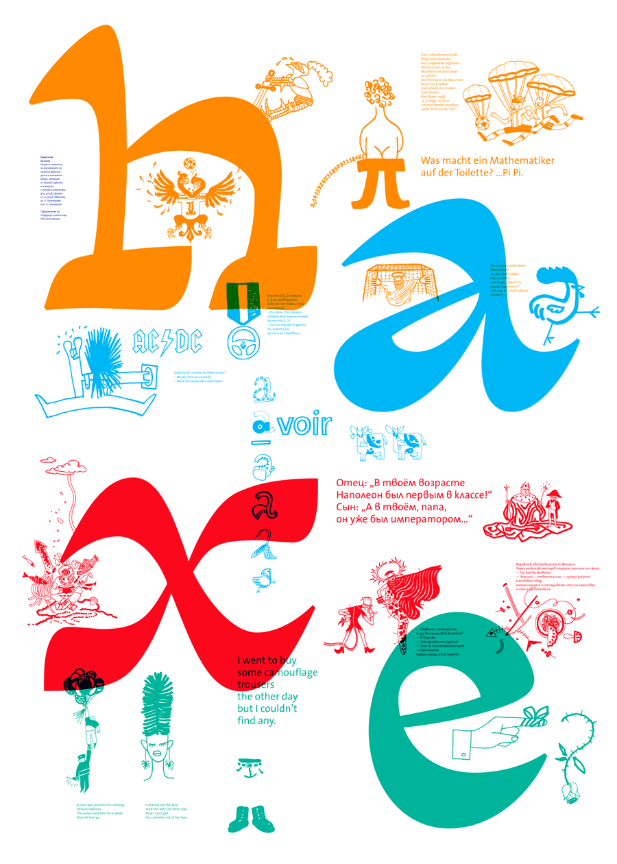
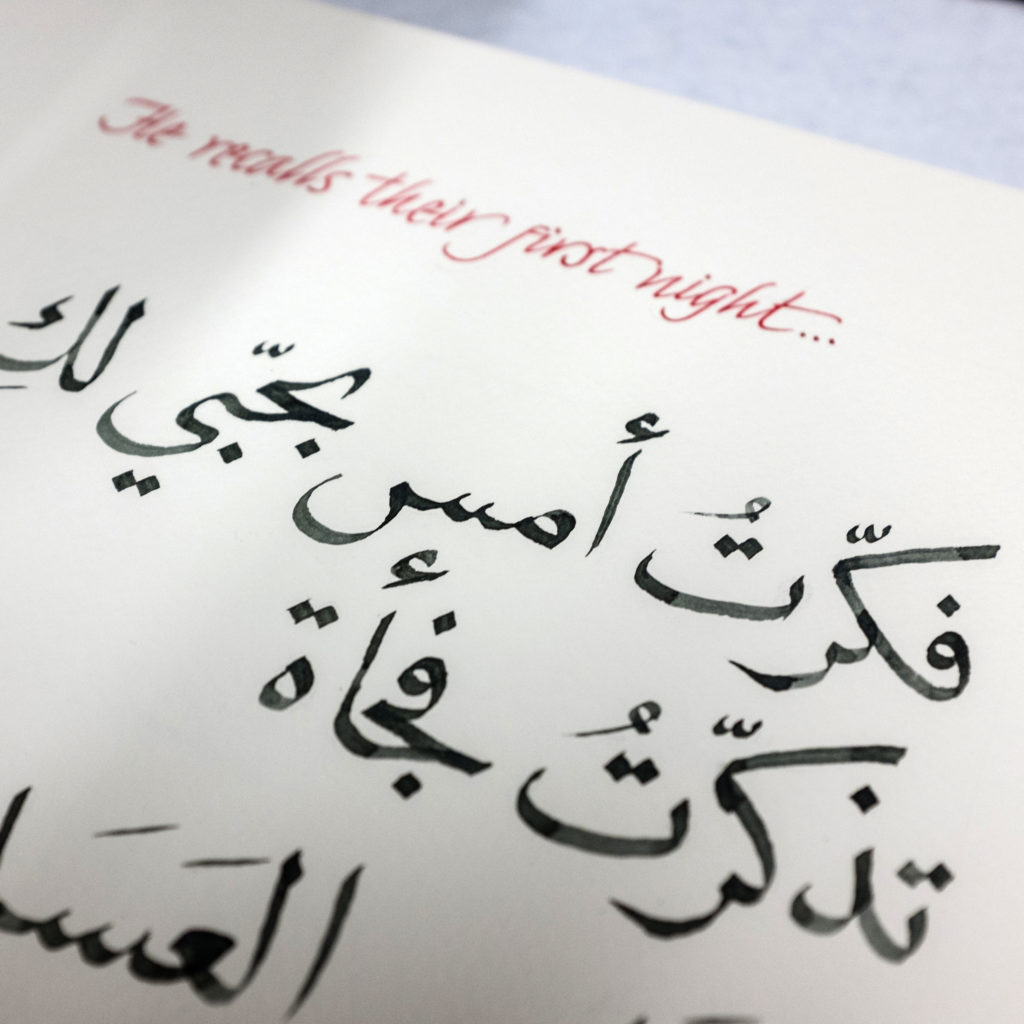
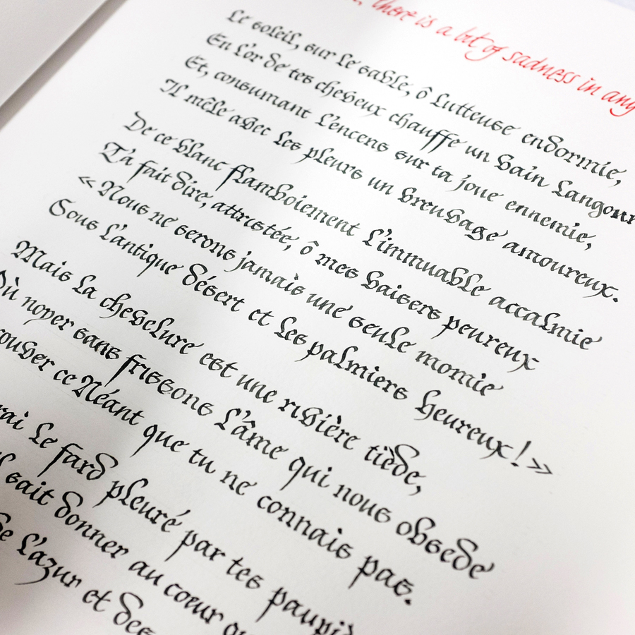
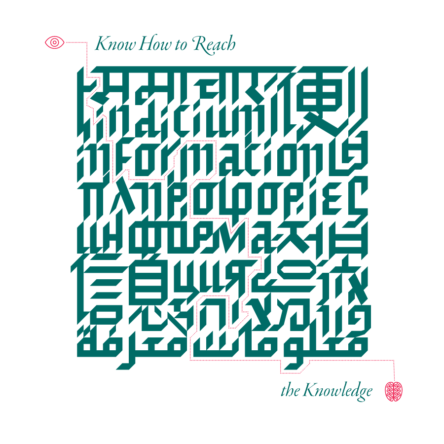
A font primarily performs the function of visualizing language, speech. But it can also be valuable in the context of illustration: on the one hand, the font carries information about both the text content and the flavor of a given era, culture, and technology of construction or writing; on the other hand, the general drawing and that of the individual letters of the specific font give rise to sensations and associations that complement the main text or create parallel and autonomous meanings.
Which font do you dream of "making in Cyrillic"?
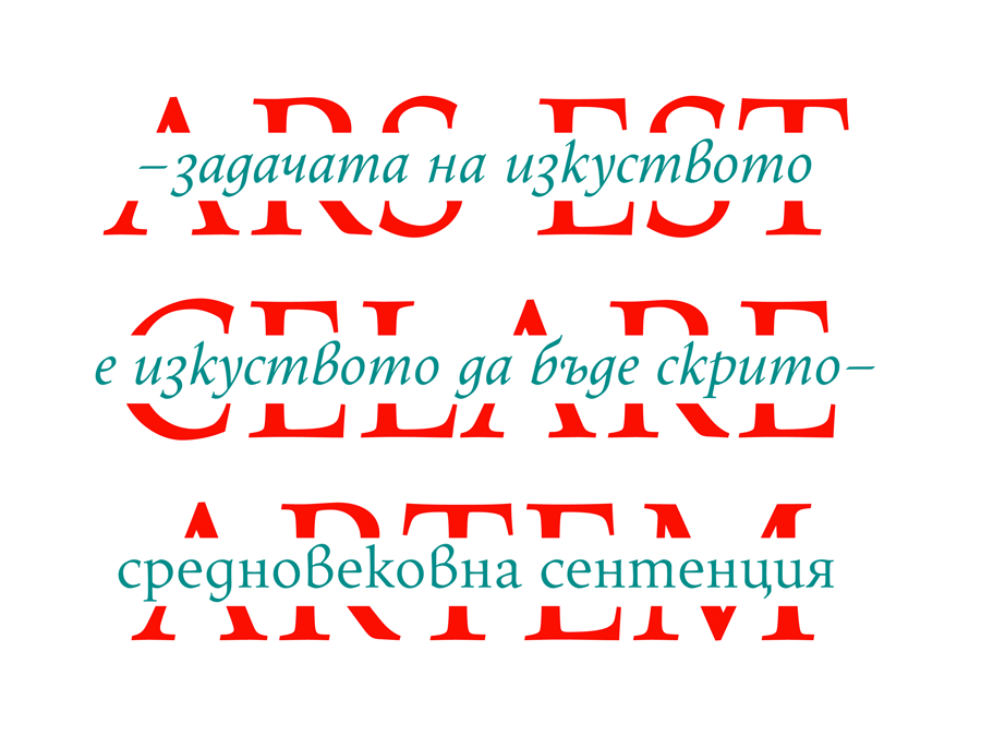
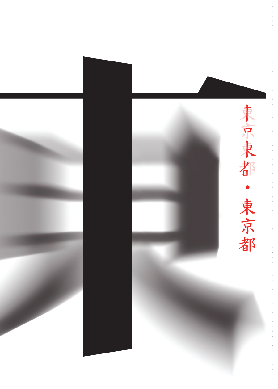
Most fonts for which I have been responsible also include Cyrillic. And yet, to answer the question, I will mention classics that do not have good Bulgarian Cyrillic or do not have Cyrillic at all, such as Zapfino, Futura, and others. Or some fonts that were created specifically in the context of non-Latin Asian cultures and others and differ greatly in their structure.
What do people most often NOT know about fonts?
A quality font is a complex system, the creation of which requires deep knowledge of writing, design, optical regularities, and technology.
Apart from that, each font has a precisely established application, beyond which it cannot function fully, and can even be dangerous for people – for example, on road network signs, where drivers have to make quick decisions in bad weather conditions, the font has a huge impact. The same applies to the readability of the font in instructions for medicines, visual communication, etc.
Therefore, my recommendation is that end users should study the issues of their assignments well, use quality fonts, trust the font designers and read the information, instructions and licenses for these same fonts.
Another local Bulgarian aspect that is gradually gaining more and more publicity is about the round and rectangular Cyrillic, better known as Bulgarian and Russian Cyrillic. These are stylistic alternatives to the same letters, with the main difference being in the regular, i.e. lowercase letters, where in Russian they resemble reduced capital letters, while in Bulgarian Cyrillic each regular letter has a different shape and distinctive character, and with predominantly more upper and lower lengths. This is reflected in the more dynamic overall silhouette of the words, easier readability and, last but not least, more pronounced aesthetic qualities, in contrast to the overall more monotonous silhouette of Russian Cyrillic. In addition, the rounded Bulgarian Cyrillic is a sign of our national cultural identity, something that we must preserve. More information can be found here.
Website:
https://www.behance.net/NikiPetrus
Facebook/Instagram/Twitter page:
https://www.facebook.com/nikolay.petroussenko
https://www.instagram.com/petrusenik

Add comment