


In May, we can’t help but pay attention to letters and fonts. That’s why we’ll introduce you to four wonderful artists who work in the field of type. We started with Ani Petrova, Katerina Kiricheva, and today it’s the turn of…
Milena Valnarova
Date and place of birth: July 10, Sofia.
Education: National Academy of Arts, majoring in Illustration and Book Design, Schule für Gestaltung, Basel, postgraduate specialization in Printing Techniques.
Professional experience: Freelance graphic designer.
Exhibitions:
Exhibitions in Switzerland, Germany and Bulgaria. Most recently: within the framework of Typofest 2014 together with Velina Mavrodinova and Iliya Gruev.
Awards:
2001 Mayor of Osaka Prize, 10th International Design Competition, Osaka, Japan
2002 Gold prize 2002 International Communication, Design Competition by Communication
Design Association of Korea
2002 Silver prize 3th International Design competition, Nagoya Design Do!, Nagoya, Japan
What does it actually mean that you "deal with fonts"?
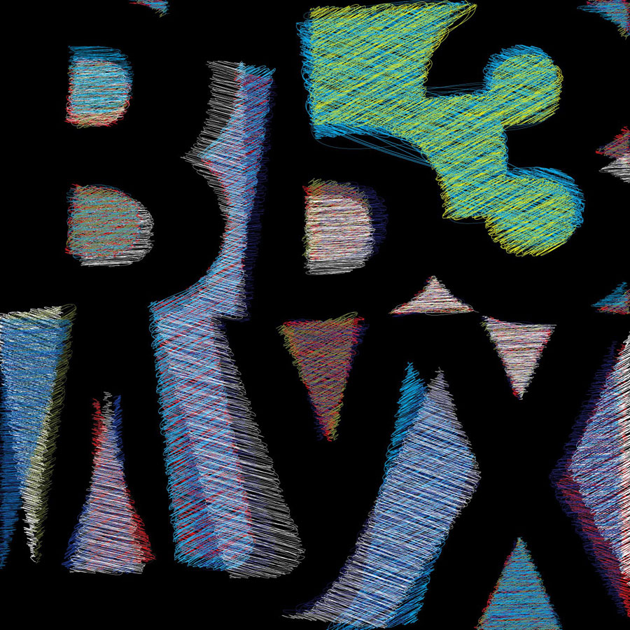
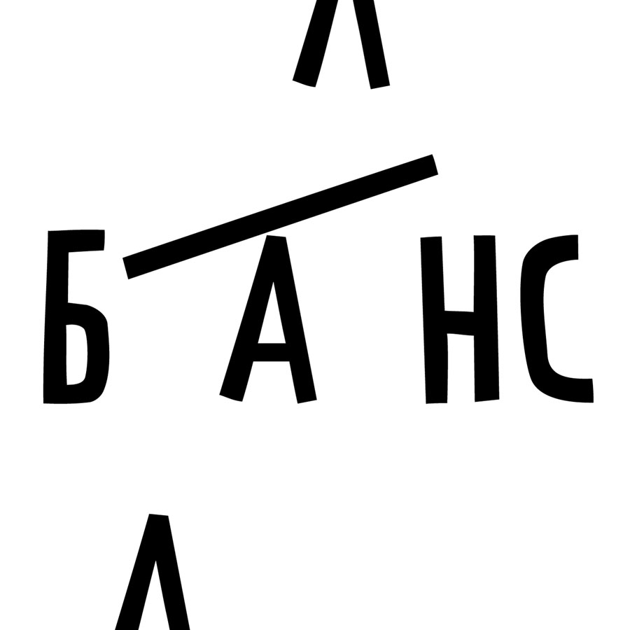
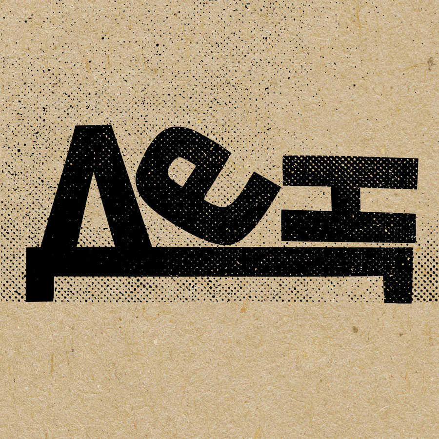
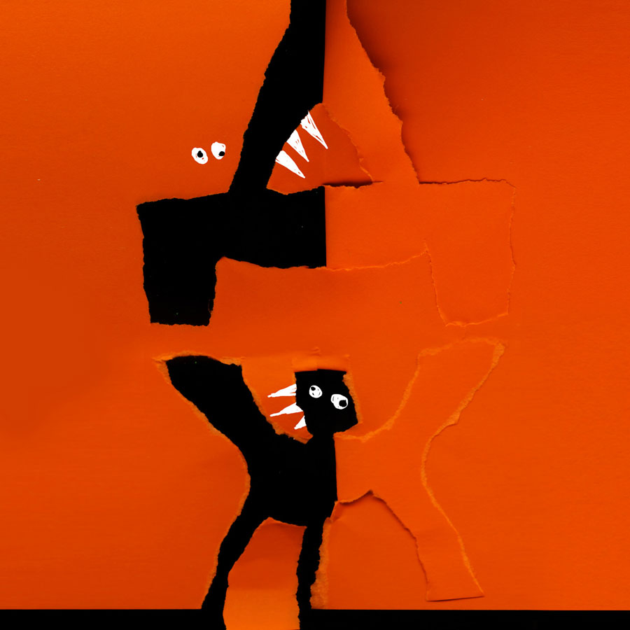
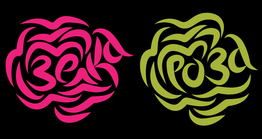
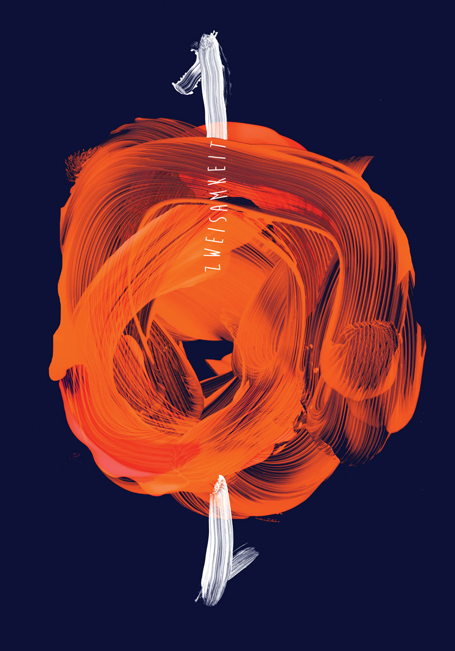
Most often I use them not "for their intended purpose", as illustrations and a means of short expression.
Is there a difference between a letter and a font?
Like between a number and a number system. A font is a system of symbols (letters).
Favorite font: Univers.
Is a font an illustration?
A font is one of the tools for illustrations...
What font do you dream of "making in Cyrillic"?
"Making" fonts is serious work, requiring special knowledge, dedication and patience. There are more and more people in Bulgaria who do this beautifully, I believe that the moment may come when the damage from the 90s in the Cyrillicization of fonts will go down in history. Most of the fonts that I would choose are already Cyrillicized, and I would not undertake such a task.
What do people most often NOT know about fonts?
HOW they are used is very important. There is no system that will work if it is deformed. Respect for the work of the authors of the fonts and for typographic standards is important. Regardless of the type of font, the result of a space before the comma and letters flattened by 40% is equally unacceptable.
Website: https://www.facebook.com/milena.valnarova
Facebook/Instagram/Twitter page: https://www.instagram.com/milenavalnarova/





Add comment