


In May, we can’t help but pay attention to letters and fonts. That’s why we’ll introduce you to four wonderful artists who work in the field of type. We started with Ani Petrova, today it’s the turn of…
Katerina Kiricheva
Date and place of birth: April 23, 1993, Pazardzhik
Education: I graduated from the National Art High School “Ilia Petrov”, then a bachelor’s degree in the “Book and Printed Graphics” department at the National Academy of Arts, where I also defended my master’s degree in the “Art of the Book” program.
Professional experience:
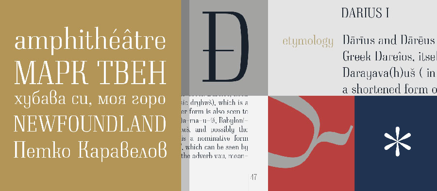
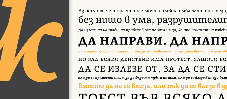
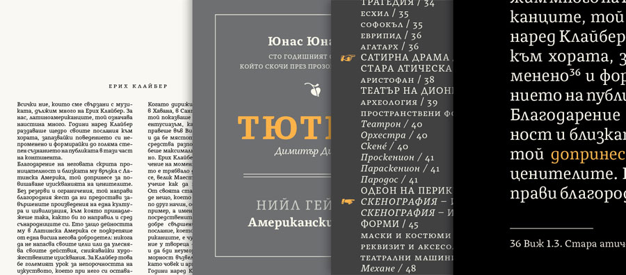
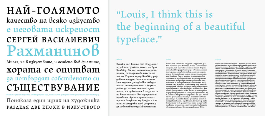
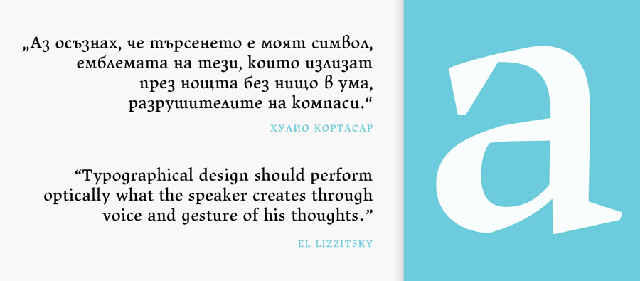
I have been part of the Bulgarian type studio Typedepot for more than a year.
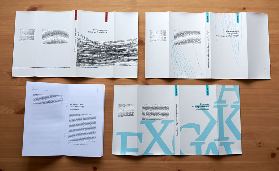
I also work with individual authors and publishers as an art designer and designer of books and their covers. I also work in the field of logo and brand design.
Exhibitions and awards: I have various participations and awards, but not in the field of type art, and at the moment this is my focus.
What does it actually mean that you “do type”?
It means passion and dedication, love for detail and patience, because the process from designing on paper to a working type family is long and full of doubts, changes, trials and errors.
Is there a difference between a letter and a font?
I would paraphrase “Is there a difference between a note and a song?” The letter could be beautiful in itself, but the font is a string of letters creating a complete melody and depending on the nature of the chords we can create a font with a categorical sound like Wagner’s Valkyrie or the melodic Chopin’s Nocturne.
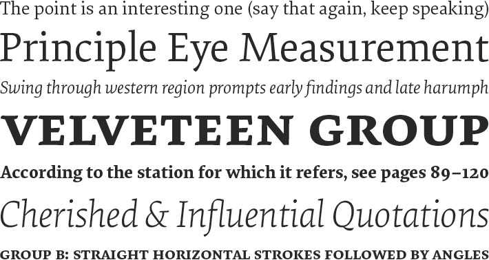
Favorite font: It’s hard for me to define a “favorite font”. It’s like claiming a painting, for example Munch’s “The Scream”, and thus leaving all other works of art behind. But the first one that came to mind was Elena by Process Type Foundry. A beautiful serif, typeface with finesse and restraint in the forms and a modern look.
Is the font an illustration?
No. Typography or individual letters could serve the territory of the illustration, and create an incredible picture, but the font is intended to be functional.
Which font do you dream of "making in Cyrillic"?
It's like, I rather dream of building and completing my own font sets.
What do people most often NOT know about fonts?
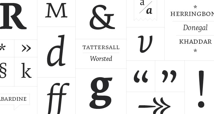
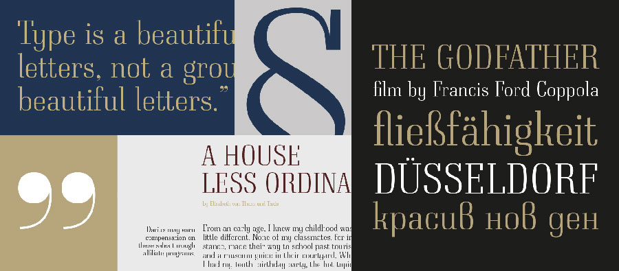
Probably, that a font does not consist of 32 letters, but at least 700-800 symbols, and that making it is not a mechanical job, but an art that requires its own time, development and precision. And no, not all fonts are made 🙂
Website:
Add comment