


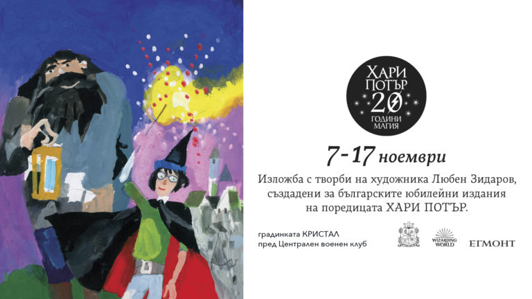
The new editions of Harry Potter with covers by Lyuben Zidarov have become the news of the week, not only in artistic circles. In the Facebook space, the debates “for” and “against” have raged like a watercolor brush in a jar of water. Both sides of the dispute about the “beauty” of the editions and the other have fallen into extremes. This is the place to make the reservation that I will not dispense justice, I will not impose my personal opinion regarding the covers and the artist’s overall work, but I would like to look back a little in time and space to explain, even if only for myself, how we came to these covers and this debate.
It is only right that I be correct and admit that it was not my generation that grew up alongside the books illustrated by Lyuben Zidarov, but that of my parents, although he managed to sneak into my life at a different age. We... waited for Harry Potter in front of bookstores at 2:00 a.m. to be the first to buy the "new" book in the series.
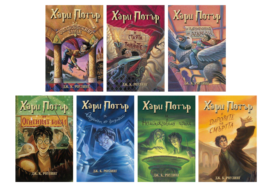
You realize that we have known the artist's style for decades, and this is not at all surprising, considering that he actively worked during the socialist realism period, conventionally divided into three periods, and after its end, so that we can see today the anniversary covers of Harry Potter. Of course, Lyuben Zidarov's aesthetics change over time, but we have recognized his work in various children's books since the 1950s.
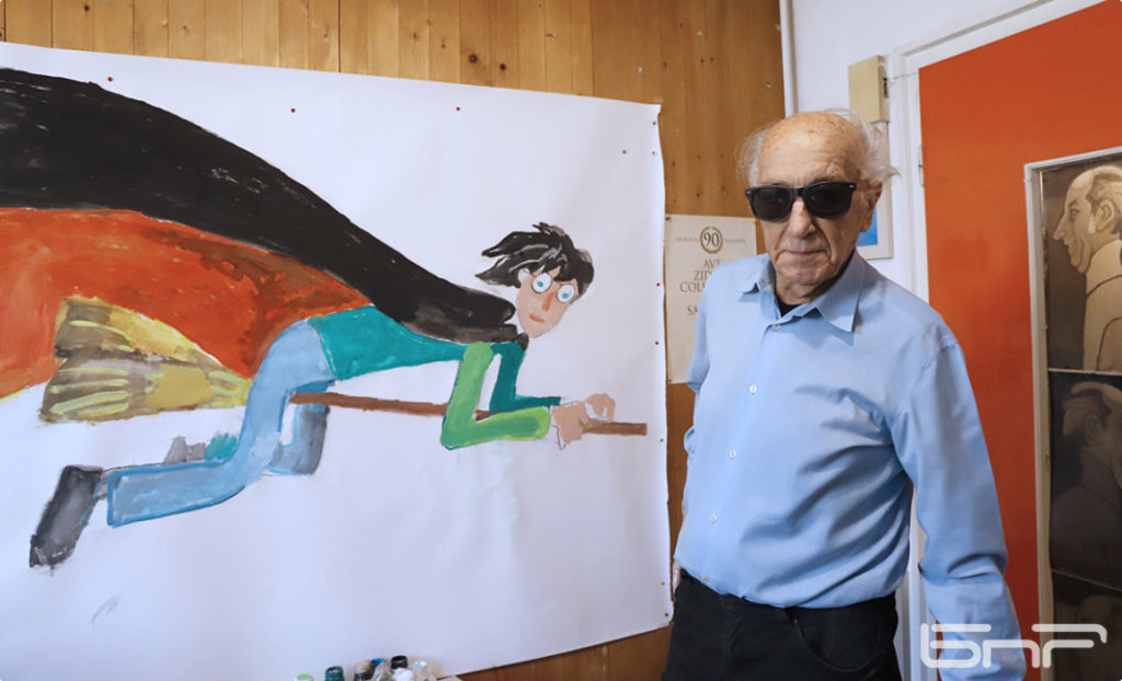
And because we often do not orient ourselves correctly in years, but numbers are something we cannot argue with, let's do a simple mathematical calculation. Lyuben Zidarov was born on December 23, 1923 (today he is 95 years old), and in 1948 (at 25) he graduated from painting in the course of Iliya Petrov. He created illustrations for the newspapers "Septemvriyche", "Plamache" and "Druzhinka" of Detizdat even before he was accepted as a student. In 1949 (at 26) he became a member of the Union of Bulgarian Artists, and later - part of the management board, in 1979 (at 53) he became deputy chairman, and subsequently secretary of the union in the period 1996-1999 (at 73). Since 1967 (at 41) he has worked as chief artist at the publishing house of the Central Committee of the DKMS "Narodna Mlazed". He won numerous awards for his illustrations, not only in Bulgaria but also abroad, and in 1979 (at the age of 56) he received the title of "People's Artist".
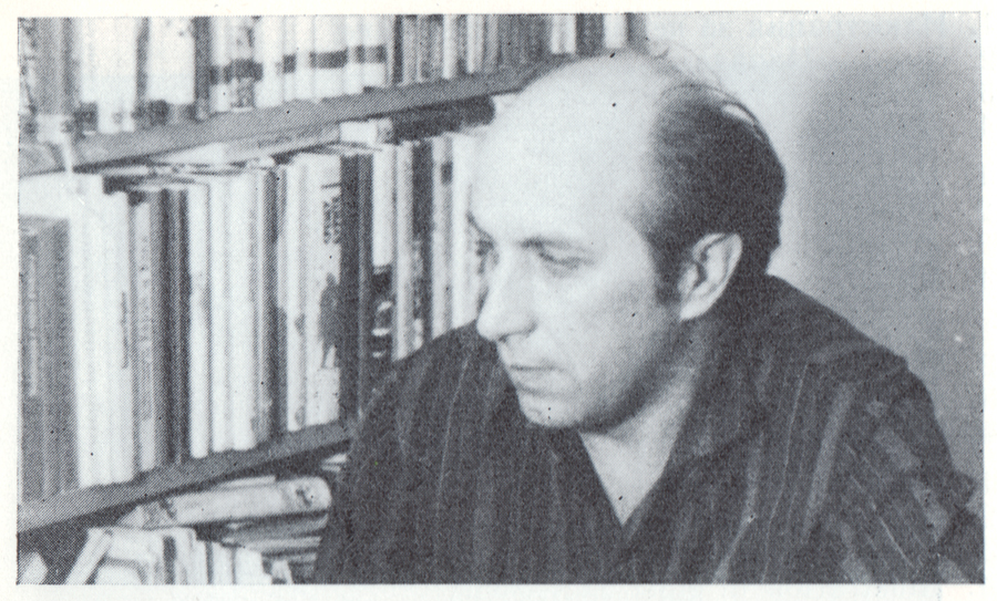
Even in “those years” Lyuben Zidarov was recognized as one of the masters of illustration in Bulgaria and perhaps this fact stirred up the spirits to this day. Certainly, the superposition of too many layers made every sheet signed by the artist become an artistic value, praised by illustrators, publishers, journalists and critics for years. No, this is not new, it is not a phenomenon, because the same attitude is observed in the works of Iliya Beshkov and Boris Angelushev, who created eponymous styles and entire schools of illustrators in the 1950s.
Zidarov himself was influenced by them at the beginning of his work. “Overcoming some of the cross-influences of Beshkov-Angelushev, L. Zidarov’s work is increasingly distinguished as a talented, cheerful work reflecting the new way of life of our pioneers, whose images still suffer from insufficiently truthful psychological and social characteristics and typicality”[1] – notes the report for “Discussion of the State and Tasks of Contemporary Bulgarian Illustration” from 1953, which has become a Bible for illustrators.
However, one question has always bothered me: does the fact that artist X has signed his work automatically make his work priceless in every aesthetic, artistic, market and social respect? Personal opinion – no! I am extremely happy that today, 30 years later, we have the right to say “no, we don’t like the illustrations of artist X!” Everyone is entitled to this personal opinion, and to some extent the fact that the guild literally split in two is a sign that we are gradually shaking off the slavery of names and even “young artists” allow themselves to have a clear, concrete and expressed opinion in front of their colleagues. And I am not talking here only about the case of Lyuben Zidarov, but in general about the prevailing fear of the type “you can’t say you don’t like him!”. Yes, you can!
However, you will be surprised that such opinions crept in even before 1989, and quite publicly in artistic circles, especially considering the fact that not every article, thought and idea had the opportunity to see print. And since I am sure that you have delved well into all kinds of social networks, and some book and culture sites have already quoted each other, I decided to dig into the past and look for what cannot be found with Ctrl+F. And here is what I found:
“Comrades, look at the artistic illustrations of books, and especially the illustrations of children’s and young people’s books. Children and young people are drawn like idiots. I must tell you that when I look at some illustrations of children’s and young people’s books, I remember our grandmother’s old tales about goblins and scoundrels who roamed the earth and kidnapped naughty children – that’s how she used to scare us, so that we would be peaceful and obedient. I’m not saying that all illustrations are like that, but from year to year this style of bad illustration is becoming more and more widespread, and it is not clear how far it will go. It will encompass more artists. They will draw a child with his head on one side, his hands on another, the flag on a third. For such illustrations, for such deformations, the youth publishing house [“Narodna Mlazed”] and the “Bulgarian Writer” publishing house hold the flag. It is also present to one degree or another in other publishing houses. And this is already entering some posters. And if it is not dominant now, it may become dominant tomorrow. Of course, if measures are not taken”[2].
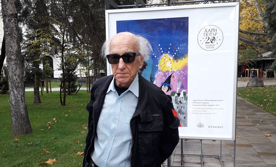
More or less, the debate about Harry Potter and Lyuben Zidarov has unfolded in three directions, which formed a neat braid, framing the questions of the beautiful, the ugly and why this particular artist was chosen, and often the boundaries between the three problems are blurred. Therefore, I allow myself to intertwine what struck me and will try to formulate the three main contemporary problems:
“Illustrations are socialist” – in fact, there is a small catch here. The illustrations themselves are not “society” and are in no way even close to that “social realism” that everyone talks about, but few remember what it actually represented.
And, so that I am not speechless, here are some books that L. Zidarov illustrated before the Bulgarian National Library took its fictional “April line”, to which it may be more correct to subsequently attribute part of the artist’s work.
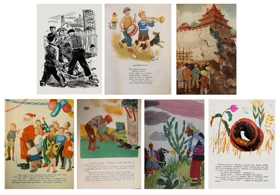
However, it is unlikely that anyone will associate these books with the name Lyuben Zidarov on the prima vista. We know the artist more for his creative solutions to titles such as “Andersen’s Fairy Tales”, “Tom Sawyer”, “Treasure Island” and many others.
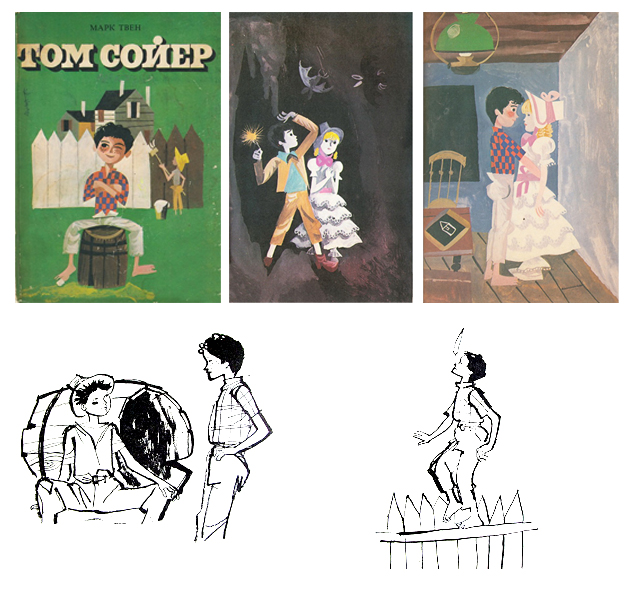
In 1963, several classic works for children were released on the market, including “Tom Sawyer”, illustrated by L. Zidarov. The book caused polar reactions and even then the artist was “accused” of what we still comment on loudly today. Maximilian Kirov writes: “We stop at the very beginning of these works [“The Prince and the Pauper”, “Tom Sawyer” and “Fairy Tales of the Brothers Grimm”, illustrated by B. Angelushev, L. Zidarov and I. Kyosev respectively], because they represent a great success for our illustration (…) I think we can afford the courage to say that in terms of their merits the works of all three of our artists rightfully rank among the best contemporary achievements” [3]. But V. Petrov[4] is in absolute horror: “In “Tom Sawyer” with illustrations by L. Zidarov the form is in a deplorable state. River ships of that time are known to be such only by people who have seen them painted before. The legs of Tom Sawyer’s friends resemble frog legs, and they themselves are effigies. (…) He [Tom Sawyer] is drawn with a thin neck, crooked rachitic arms, wide and flat feet – one with four toes. (…) Is that possible? (…) We read Tom Sawyer long before L. Zidarov took up illustrating it and M. Kirov praised him for it, but the illustrations in the then edition were a true work of art. What made the publishing house replace them with those of L. Zidarov is not clear to us, but we believe that in the future this should only be done if there are illustrations that are better than the existing ones.”
“Illustrations are scary and not for children” – the eternal theme of how much we all know what children love and like. There are dozens of artists who have been accused of their illustrations not being for children, and today we look at their works as cornerstones, each of whom turned the wheel of illustration that had entered the rut of its time. We all know that mothers are the highest and final authority for everything, but realistically speaking, they are not art critics!
In 1979, the magazine “Izkustvo” published a survey aimed at Borislav Stoev, Lyuben Zidarov and Simeon Venov. One of the questions was “What do you think about the “parent-illustrator” relationship”[5]. Here are some of the answers:
Borislav Stoev: “Those who have worked in a publishing house know how many letters are received from parents “concerned about the aesthetic upbringing of their children” (…) full of reproaches to Bulgarian artists who “rudely and with misunderstanding deprive our children of the best (?!) in their peace of mind”. Or who “draw such ugly and ridiculous drawings, a true parody of bad taste (?!!)”.
Lyuben Zidarov: “These relationships become mischievous from the moment parents feel authorized to judge on behalf of the children, impatient to see them as brilliant as possible, correcting with the straight measure of the adult’s strange and highly emotional world (…)”.
Simeon Venov: “There is no parent at all. There are different parents, with different education, different attitudes (or lack thereof) towards cultural values, different professions, ways of life and thinking (…)”.
“The Mariah Phenomenon” – this record is neither new nor has it achieved anything over the years, but there is always someone who takes it out and spins it on the turntable. In the late 1950s, the "People's Youth" published the translated books "The Adventures of Pinocchio" (1957) by C. Collodi, "The Wild Swans and Other Tales" (1959) by H. K. Andersen and "African Tales" (1964) by R. Peccarie with illustrations by the Italian artist Libico Maraya, "Snow White and Other Tales" (1959) by the Brothers Grimm with illustrations by Sandro Nardini, "Little Muck" (1960) by V. Hauf with illustrations by Cremonini, "Little Red Riding Hood and Other Tales" (1958) by S. Perrault and "The Snow Queen and Other Tales" (1961) by H. K. Andersen with Gianni Benvenuti. Yes, these books remain emblematic to this day and were recently reissued in a completely new edition and an updated translation, but are they the yardstick by which we should measure Bulgarian illustration?
I will give two very fragmentary quotes from nearly 60 years ago. In 1963, Vladimir Petrov wrote: “Before each of us, when the fairy tales of the Brothers Grimm or Andersen are mentioned, when Pinocchio is mentioned, along with the content, the images stand out, magnificently drawn by artists who have been inspired to penetrate it. Everyone, even older people, admires the illustrations of Maraya, Nardini, Cremonini, Benvenuti like a child…”[6] – the article continues with a long description of these illustrations and a kind of accusation against Bulgarian artists that they often spoil the books with their illustrations. 16 years later, Borislav Stoev said: “The standard for parents’ memories are the “wonderful” illustrations of Maraya, Benvenuti or at least Lazarkevich, and they recommend that publishers publish more (or only) books with their illustrations. Of course, these recommendations are supported by the authoritative “assessment” of their child (…)”[7].
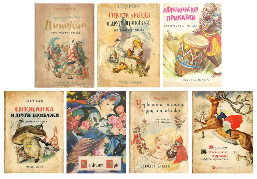
Have we read these comments today, only not in the pages of art magazines, but on social networks? The fact that we keep returning to the illustrations of L. Maraya, but also to those of L. Zidarov, means that both artists have left their mark on the development not only of native illustration, but also in the perceptions of readers. Whether we like them or not – this is the personal opinion (as I already said) of each reader, be he a parent, teacher, publisher or child.
Why this particular artist was chosen to create the vision of the new editions of Harry Potter, only the publisher can say, after all, we are talking about a business and private order on the free market. But I am sure of one thing, whoever the “chosen illustrator” was, we would have listened to the same comments “for” and “against”.
Text: Milena Radeva
[1] Bosilkov, S. T. Mangov. Discussion of the state and tasks of contemporary Bulgarian illustration. S., 1953, p. 36
[2] Zhivkov, T. The Communist Ideology – the Supreme Principle of Our Literature and Art: Speech at the Meeting of the Politburo of the Central Committee of the Bulgarian Communist Party with Workers on the Cultural Front, Delivered on April 15, 1963, S., 1963, p. 26
[3] Kirov, M. With Greater Demandingness for the Illustration of Children’s Books. Art, 1964, vol. 2, pp. 10-17
[4] Petrov, V. Let’s Not Allow the Decadent in the Illustration of Children’s Books to Negatively Influence the Education and Upbringing of Students. Primary Education, 1963, vol. 9, p. 573
[5] Ten Questions on Children’s Illustration. Art, 1979, vol. 7, pp. 38-43
[6] Petrov, V. Let's not allow the decadent in the illustration of children's books to negatively affect the education and upbringing of students. Primary Education, 1963, vol. 9, p. 571
[7] Petrov, V. cit. comp.
Add comment